So here is a curious thing about me -
When I get to the end of a book, I like reading about the type in which it was set. I know nothing about typeface except I am drawn to the shape of things. I notice the shape of things as I move through my day. I have a little collection of scraps from magazines, ads, and worship bulletins that have interesting designs. I think one day I will use them or be inspired by them in creating art of my own.
When I get to the end of a book I keep turning the pages until I get to: ABOUT THE TYPE. Sometimes it is one sentence and sometimes it is a story unto itself.
Here is what I found today at the end of The Trouble with Poetry and Other Poems by Billy Collins.
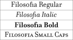
The text of the book was set in Filosofia. It was designed in 1996 by Zuzana Licko, who created it for digital typesetting as an interpretation of the sixteenth-century typeface Bodoni. Filosofia, an example of Licko’s unusual font designs, has classical proportions with a strong feeling, softened by rounded droplike serifs. She has designed many typefaces and is the cofounder of Émigré magazine, where many of them first appeared. Born in Bratislava, Czechoslovakia, Licko came to the United States in 1968. She studied graphic communications at the University of California at Berkeley, graduating in 1984.
See? It is like a treat at the end of the book. A little gem. Like when you finally arrive at your hotel at the end of a long day and you see a chocolate on your pillow. Whether it was an easy journey or fraught with peril…here is a treat.
Whether it was a great read or disappointing…here is one last creative splash on the page before closing the back cover: ABOUT THE TYPE. A little extra treat to savor.
~ Pam
When I get to the end of a book, I like reading about the type in which it was set. I know nothing about typeface except I am drawn to the shape of things. I notice the shape of things as I move through my day. I have a little collection of scraps from magazines, ads, and worship bulletins that have interesting designs. I think one day I will use them or be inspired by them in creating art of my own.
When I get to the end of a book I keep turning the pages until I get to: ABOUT THE TYPE. Sometimes it is one sentence and sometimes it is a story unto itself.
Here is what I found today at the end of The Trouble with Poetry and Other Poems by Billy Collins.
The text of the book was set in Filosofia. It was designed in 1996 by Zuzana Licko, who created it for digital typesetting as an interpretation of the sixteenth-century typeface Bodoni. Filosofia, an example of Licko’s unusual font designs, has classical proportions with a strong feeling, softened by rounded droplike serifs. She has designed many typefaces and is the cofounder of Émigré magazine, where many of them first appeared. Born in Bratislava, Czechoslovakia, Licko came to the United States in 1968. She studied graphic communications at the University of California at Berkeley, graduating in 1984.
See? It is like a treat at the end of the book. A little gem. Like when you finally arrive at your hotel at the end of a long day and you see a chocolate on your pillow. Whether it was an easy journey or fraught with peril…here is a treat.
Whether it was a great read or disappointing…here is one last creative splash on the page before closing the back cover: ABOUT THE TYPE. A little extra treat to savor.
~ Pam